As a savvy social media marketer, you already know analytics matter. The hard part is figuring out what to track, how to organize it, and how to turn all that data into something useful.
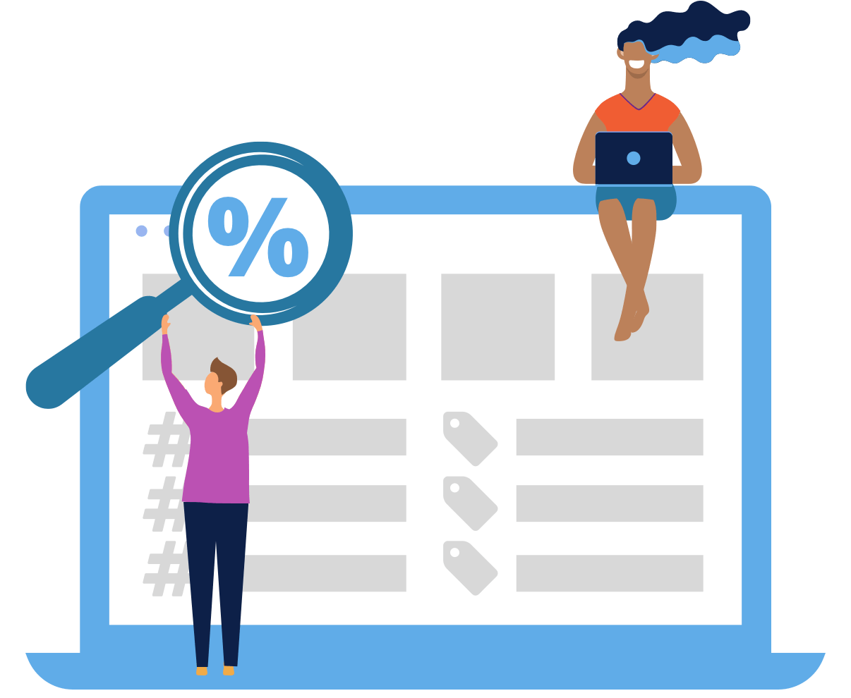
That’s where a social media analytics dashboard comes in.
This guide will cover what a social media dashboard is, why it matters, and how to build one that actually supports better decision-making. We’ll walk you through the different types of dashboards you can create, the metrics worth paying attention to (and the ones to leave behind), how often to run your reports, and more.
Ready to get clear on your metrics? Let’s dive right in.

Learn how you can easily build social media analytics dashboards with Rival IQ
See the videoWhat’s a social media analytics dashboard, anyway?
“Dashboard” can mean a lot of things depending on who you ask, so let’s get specific.
For the purposes of this social analytics-focused article, a social media dashboard is a visual, real-time snapshot of your most important social media metrics. It pulls data directly from your social platforms and turns it into easy-to-digest charts and graphs, so you can quickly see what’s working, what’s not, and how your performance is trending over time.
To be clear, a social media analysis dashboard is NOT a laundry list of every social metric you can get your hands on. Editing is really importnant (<–editing joke) because too much data can easily overwhelm you or your coworkers and become unhelpful.
At a minimum, your dashboard should make you say “Hells yes!” to the question, “Does this clearly show how my social media strategy is performing and progressing over time?” Bonus points if you can answer the same to the question, “Can my boss understand it too?”
Why social media dashboards matter (and what they’re actually for)
It’s easy for everyone in marketing (including me!) to get caught up in the doing and forget about the “how’s it doing?” That’s where dashboards earn their keep:
- Social media dashboards show impact over time. Dashboards make it easier to demonstrate how your work is benefiting the business. Trends, growth, and conversions are much clearer when you can see everything in context.
- They keep everyone aligned. When different team members pull data from different platforms at different times, things can get messy. A unified dashboard ensures everyone — from social media managers to CMOs — is looking at the same data when making decisions.
- Dashboards save your team time. Rather than spending hours manually pulling social data, a dashboard automates your data collection and reporting.
- They help you spot patterns you’d otherwise miss. When all your data lives in one place, it’s much easier to uncover insights that get lost in siloed platform analytics. When you can better understand which channels and content are reaching, growing, and converting your audiences, you can smartly invest your time, efforts, and budget.
- Dashboards make it easier to justify budget. Accurate info = ability to demonstrate impact = bigger marketing budgets. Keeping an eye on your performance will help you get a bigger piece of the pie.
Ultimately, a well-designed social media analytics dashboard isn’t just a reporting tool but a communication tool. It turns your hard work into something stakeholders can actually see, understand, and invest in.
Types of social media dashboards
One of the biggest advantages of social media dashboards is that there’s no single “right” setup. You can build different dashboards tailored to what you’re trying to understand, who you’re reporting to, and how closely you need to track performance.
Dashboards usually fall into a few common categories. Think of these as starting points. You can go deep on one or combine several views depending on your goals.
1. A performance overview dashboard
For answering: “How are we doing overall?”
This is your high-level snapshot. It pulls together core metrics across one or more platforms so you can quickly assess performance and progress over time.
You’d typically include:
- Reach or impressions to understand visibility
- Engagement to see how audiences are interacting
- Clicks or traffic-driving actions
- Organic vs. paid performance, viewed side by side
This type of dashboard is useful for regular check-ins, monthly reporting, or leadership updates. In other words, when big-picture insights matter more than granularity.
2. A content performance dashboard
For answering: “What’s actually working?”
Once you know how things are performing overall, the next question is usually why. A content-focused dashboard lets you move from the macro to the micro by breaking performance down post by post.
This view might highlight:
- Top- and bottom-performing posts by engagement or clicks
- Performance by content format (video, carousel, static, etc.)
- Trends over time that show which topics or formats consistently resonate
The goal here isn’t just to report the numbers. You want to identify patterns. This kind of dashboard helps you decide what to double down on (and what to stop spending time on).
3. A paid social or campaign dashboard
For answering: “Is this worth the money?”
If you’re putting budget behind social, you’ll want a dashboard built specifically around paid performance. This keeps investment-focused metrics front and center.
Some common metrics:
- CPM, or cost per thousand impressions, is a great way to see how much you’re spending to get eyes on your posts.
- Cost Per Result is a little more variable depending on the action you’re trying to get your customers and fans to take. For instance, if you’re aiming for clicks, you’d want to measure your cost per click (CPC).
- ROAS, or return on ad spend, is calculated by dividing the revenue your ad spend brought in by its cost (revenue/cost). While it’s similar to social media ROI, ROAS stands out for being ad-centric, allowing you to take a closer look at your Instagram Ads campaign and figure out what’s working and what’s not.
Having these metrics in one place makes it much easier to spot underperforming campaigns early and to justify spend when things are working.
4. A competitive benchmarking dashboard
For answering: “How do we stack up?”
Social performance doesn’t exist in a vacuum. A competitive dashboard adds context by showing how your metrics compare to others in your space. After all, anyone can have a million Facebook fans or Instagram followers, but you’re only reaching those fans successfully if you’re doing it better than your competitors.
The basic premise of social media benchmarking is identifying key competitors and leaders in your industry and then keeping an eye on their social metrics over time to check against your own stats.
If you’re Pepsi, you’re probably crawling Coke’s social presences on the regular to see how their page likes and key engagement metrics (likes, shares, comments, etc.) compare to your own performance. The very same goes for smaller or more local competitors.
Depending on your goals, the metrics might include:
- Engagement or follower growth rates across a competitive set
- Channel-by-channel comparisons
- Share of voice or brand mentions trends
A competitive benchmarking dashboard is especially valuable for strategy discussions, quarterly planning, or explaining results to stakeholders who want to know how your brand compares.
Pro tip: It’s pretty safe to say we’re obsessed with benchmarking here at Rival IQ — so much so that we make a big, free report every year tracking Facebook, Instagram, X (formerly Twitter), and TikTok performance across top industries like fashion, media, and auto. To see how your industry is doing at a glance, check out our Social Media Industry Benchmark Report.
And to keep things current and interactive, we also have live benchmarks for top industries, including the most popular hashtags, top-performing posts, posting frequency, and more. Use these for a current snapshot of how you measure up to your competitors.
The most important metrics to focus on
No matter which type of dashboard you build, the same rule applies: every metric should earn its place. Instead of trying to track everything, choose metrics that help you answer questions and make informed choices.
For example:
- A performance dashboard might prioritize engagement, clicks, and conversions over vanity metrics
- A content dashboard might focus on engagement rate and clicks rather than total likes
- A competitive dashboard might emphasize relative growth and engagement instead of raw totals
Ultimately, when your dashboard is aligned with a specific purpose, it becomes much easier to turn data into decisions (and explain those decisions to stakeholders).
How do I build a social media dashboard?
By now, you know what a social media dashboard is and what you might want to track. The next question is: how do you actually build one?
At a high level, the process looks something like this:
Step 1: Define your goals (and the metrics that matter)
Before you touch any tools, get clear on what the dashboard is supposed to answer. Is it meant to show overall performance, content effectiveness, or competitive position?
Your goals will determine:
- Which platforms to include
- Which metrics matter
- How detailed the dashboard should be
Don’t shy away from creating multiple dashboards. After all, a dashboard built for a CMO will likely look very different from one built for a social media manager optimizing posts week to week.
Step 2: Bring your social data together
This is often the hardest part. Each social platform has its own interface and metrics — and pulling data manually from multiple sources can be time-consuming and error-prone. Connecting directly to platform APIs is the best approach, but this requires technical expertise and ongoing maintenance.
If you don’t want to deal with that complexity, many teams use a platform that’s already connected to social network data and keeps it up to date automatically. (Psst, this is where analytics platforms like Rival IQ come in).
Step 3: Pick your visualization tool
Once you’ve got your sources, you need a way to visualize the data.
Broadly, teams tend to choose between business intelligence tools or dedicated social media platforms. Business intelligence tools, like Tableau, offer deep flexibility but can come with steep learning curves and setup time. Meanwhile, social media management and analytics tools are easier to use, though some tools limit what you can customize or compare.
The key thing to look for is flexibility: the ability to build dashboards around your goals, not just pre-set reports.
Step 4: Design your dashboard
A strong dashboard should be understandable at a quick glance. That means:
- Grouping related metrics together
- Choosing chart types that make trends easy to spot
- Writing clear titles so the data doesn’t need explanation
Titles, labels, and date ranges matter more than most people realize. If someone can’t quickly understand what they’re looking at, the dashboard won’t get used.
Step 5: Automate, share, and iterate
The best dashboards update automatically and are easy to share with stakeholders. Once it’s live:
- Set regular refreshes so data stays current
- Establish how and when dashboards are shared
- Revisit and refine metrics as goals change
Don’t be afraid to tweak as needed. Dashboards are there to make your life easier, so they should evolve as your strategy does.
Custom social media dashboards in Rival IQ
With Rival IQ, you get one centralized platform that pulls in all of your social media data, so you can access on-demand analytics without jumping between tools or spreadsheets.
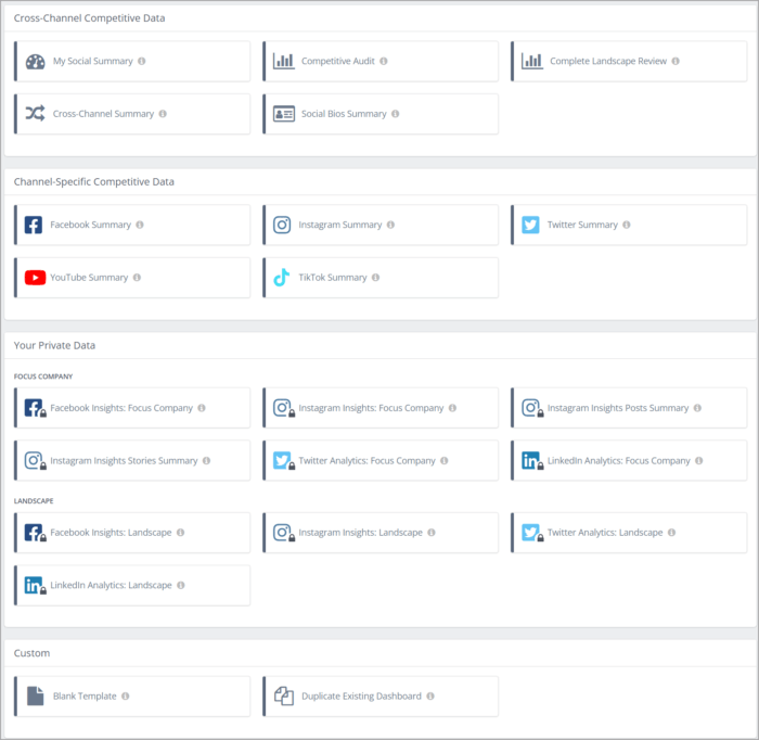
Our dashboards are a flexible collection of charts, tables, and visualizations designed to help you tell a specific data story. You can create multiple custom dashboards for different audiences or goals, and access them anytime from the Custom Dashboards section in our platform.
We put the power in your hands. You can:
- Start from pre-built templates for cross-channel or channel-specific competitive data
- Duplicate an existing dashboard and tweak it
- Build one entirely from scratch
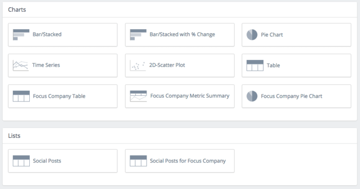
From there, you choose how your data is displayed. Put any metric you want from any and every channel into your dashboard for the ultimate bespoke analytics display. We support a wide range of chart types, including time series charts for trend tracking, bar and stacked bar charts for comparisons, and more advanced visualizations that compare multiple metrics at once.
You also have control over how metrics are calculated and displayed, including current values, previous-period comparisons, and relative or absolute change. With hundreds of customizable metrics, this is the best way to report on that one weird Facebook reaction your CEO really cares about or dialing up your cross-channel reporting to 11.
Quick example: A custom dashboard for a complete landscape review
We’re talking about visualizing data — so it only makes sense to show you what that actually looks like. Let’s walk through an example custom dashboard built in Rival IQ for a full competitive landscape review.
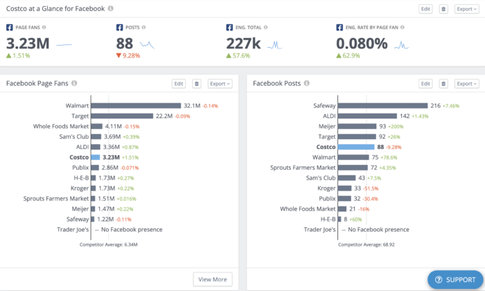
In this dashboard, Costco is the focus company and part of a competitive landscape that includes brands like Sam’s Club, H-E-B, Target, Walmart, and more. The goal here was to get a fast, clear read on how Costco is performing across social and how it stacks up against the competition.
Right at the top, the dashboard kicks things off with a cross-channel performance snapshot for Costco. You’ll see key metrics like total audience size, number of posts in the selected time period, total engagement, and engagement rate by follower. Each stat includes a percentage change from the previous period, so it’s easy to spot wins, dips, and trends without pulling multiple reports.
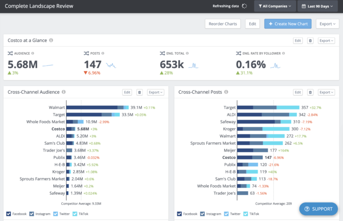
From there, the dashboard zooms out to show cross-channel competitive metrics across the entire landscape. Audience size, posting volume, total engagement, and engagement rate by follower are all laid out in clean, visual charts. Total numbers and percent changes sit right next to each metric, making it simple to see which brands are leading — and how the Costco (in bold as the focus company) compares at a glance.
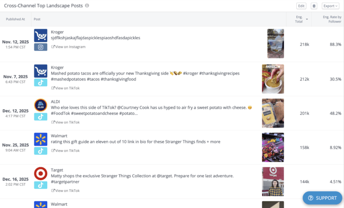
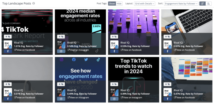
The dashboard also includes a snapshot of top-performing posts across the landscape. This is where you can quickly see the kind of content that audiences love. Each post preview can also be clicked and expanded for deeper metrics, so it’s easy to go from big-picture insights to specific content examples in seconds.
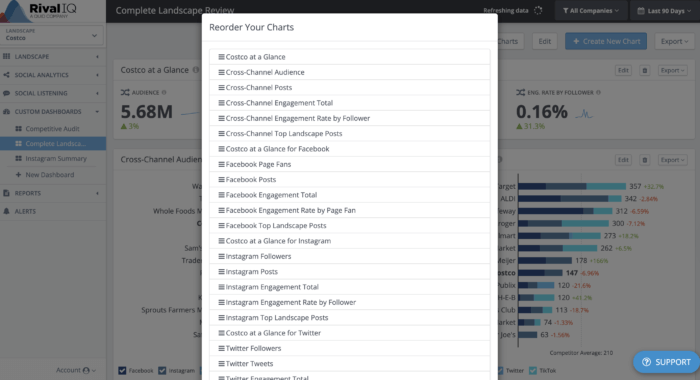
Because this is a complete landscape review, the custom dashboard then breaks things down by individual channels — Facebook, Instagram, Twitter, and TikTok. These sections are perfect for zeroing in on performance on a specific platform and uncovering channel-level insights you might miss in a purely cross-channel view.
The best part? None of this is locked in. can add new charts, remove ones you don’t need, and reorder everything to match how you want to tell the story. Whether you’re building a quick executive overview or a deep-dive for your social team, custom dashboards in Rival IQ make it easy to create a view that actually works for you.
How often should I generate reports from my dashboard?
The answer to this question, of course, depends on the nature of your job. If you’re a one-person shop, your reporting needs will no doubt look very different than those of a 25-person marketing team with a dedicated analytics lead. Our high-level recommendation? Report as often as you have the chance to share your findings and inform future strategy decisions.
If you’re still working on establishing a reporting rhythm, here’s our breakdown:
Yearly and quarterly: Big picture
These reports are all about the big picture. Here are some questions you want to be asking:
- What’s happening on your channels over time, and how are your strategies doing against your yearly or quarterly goals? (You did set goals, right?)
- Did a change in strategy, like investing heavily in Instagram, correspond to a spike in engagement?
- Are you seeing a bunch of growth or engagement on one channel in particular? If yes, you might want to pivot some of your social energy there in the quarter or year ahead.
- Has your social strategy been reflective of new features and updates, such as Instagram’s latest foray into TV?
- Does your engagement change each year with the seasons or current events (like school getting out or the holidays, for example)?
- Are there channels you aren’t very active on where you should focus some energy in the quarter ahead?
- What are your competitors up to, and how can you emulate their success?
This level of reporting is all about the 30,000-foot view, and much like a long flight, it’s good to put some time and brain power into these periodic reports.
Monthly: Diving deeper
Monthly reports bridge the gap between the granularity of weekly reports and the strategic review of quarterly or yearly reports. It’s great to keep an eye on the content, channels, and post types that are doing well. Don’t forget to compare completed campaigns against each other and against the goals you set for them.
Monthly reports can also be good for a quick check-in on your social media health: Did you lose a bunch of followers this month? Might be good to dig in deeper if the answer is “yes.”
Weekly and bi-weekly: Going granular
Weekly reports are great for tracking short time periods and content bursts. Check out how this week’s posts fared against last week’s, or look at the performance of your newest campaign. This is all about the 30-inch view, and unless your whole job is social analytics, we bet you’re not spending more than 30 minutes collecting this information.
Remember: Don’t just sit on these analytics! Use them to show your boss and team that your strategy is working, and to refine your strategy and content so it resonates strongly with your social media audience.
How to locate your social media analytics natively
The good news: Since these channels want to keep you on their platform, they make it pretty easy for you to access your stats and see how your posts are performing.
Facebook houses its analytics in two different places: Facebook Insights and Meta Business Suite. While Facebook Insights focuses exclusively on your Facebook Page’s performance, Meta Business Suite is the “umbrella” platform for managing both Facebook and Instagram.
Both sources report much of the same data, so you can take a look at your analytics in either. You’ll be able to toggle the date range and dive deeper into all sorts of metrics in order to better understand how your posts are faring.
However, if you want to export your Page’s insights data, Meta Business Suite will be the one to go to. Simply head over to the Results tab and press the export option in the top right corner of each metric. This will be how you get your data out of Facebook and into your computational software of choice (like Excel or Google Sheets) so that you can build your dashboard.
For the full rundown of accessing and measuring your Facebook performance, check out our ultimate Facebook analytics guide.
X (formerly Twitter)
Accessing Twitter analytics has gotten a bit more complicated since the platform became X. While all accounts used to have access to their performance data, as of writing, only X Premium subscribers have access to account analytics. Verified Organizations — accounts with the gold checkmarks — can also see their analytics.
Another option that X promotes is to convert your personal account into a Professional Account, which comes with helpful features for promoting your business, including a performance dashboard called Professional Home. Unfortunately, the roll-out of that has been a bit slow so not everyone has access.
The good news? Once you’ve gotten past the gates, so to speak, and secured access to your analytics, the data is available for export in .CSV format.
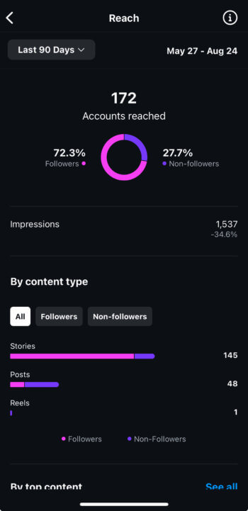
Instagram really wants you to use it on your mobile device, and requires you to be a business account (instead of an individual account, though verified accounts are an exception) to see any meaningful stats.
Fortunately, once you meet that criteria, you can access a fair amount of information about your activity, content, and audience by tapping the Professional dashboard bar under your profile description or navigating to Settings and activity (the hamburger menu in the top right corner of your profile) and then Insights . Thankfully, Instagram’s Graph API allows third-party tools (like ours) to display your stats in the desktop app or web browser of your choice.
TikTok
Like most other social platforms, TikTok requires you to have a business account in order to see your analytics. Luckily, all you need to do is toggle “on” the Business account option in your settings to get access. Once that’s done, simply navigate to your Business Suite and then click the Analytics tab. It should look a little something like this:
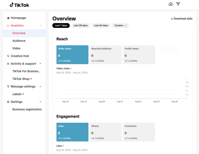
As you can see, you can easily export your insights with a click of the Download data button in the top right corner — a handy feature you’ll need to build your dashboard.
Want more details on how to approach TikTok’s analytics? We go more in-depth in our handy TikTok analytics reporting guide.
Aggregated social media analytics
Okay, we’re biased: We like seeing all our social analytics in one spot. Social media analysis software can make a marketer’s life easier so she doesn’t have to go channel by channel to access her stats. Here’s what we want in a social media analytics app:
- The ability to analyze your stats across multiple channels
- Meaningful insights to help you go beyond the numbers
- Even more stat breakdowns than you can get on native analytics (like follower adds and removes in Instagram, for example)
- Scheduled reports so your favorite social stats are delivered in-app or to your inbox when you need them
- To really take this article to a meta level, custom dashboards are a handy feature too
Use case: How do we report on social media analytics at Rival IQ?
Curious how we walk the talk? This group of self-professed data nerds loves reporting on our social media progress. Here are a few ways the company keeps an eye on social success:
Monthly full-team metrics meetings
Our marketing team reports on our social footprint in the prior month to the whole team. (For a full write-up on metrics at Rival IQ and how it relates to pizza, read on here.) We take a close look at our engagement rate by channel month over month and also strive to identify any content, content types, or paid campaigns that we should emulate next time around.
For example, we’ve noticed that our audience seems to love data as much as we do, with our most popular posts often featuring our reports on engagement, so we’re excited to add even more of that into our editorial calendar.
Emailed reports
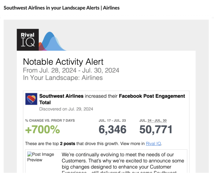
Let the robots do some of the work for you by having them crawl your social progress and your competition instead of having to do it manually. Automated social media reports from within our app are customizable, so if we want to track a particular campaign or arch nemesis, we can choose how often to get alerts in our inboxes.
Quick reference guide: social media analytics glossary of terms
Things might get a bit technical, so we’re stashing definitions of some commonly used social media analysis terms here so we’re all on the same page.
Engagement: Measurable interaction on social media posts, including likes, comments, favorites, retweets, shares, and reactions
Engagement rate: Engagement interactions divided by total follower count
Channel: The app you’re using to share your content or connect with your audience (Example: Facebook, Twitter, Instagram, TikTok, Pinterest, Google+, etc.)
Followers: Anyone who’s chosen to like, follow, or otherwise actively opted into your content and activity on a social channel
Audience: Anyone you’re hoping to connect with on social (Note: This isn’t limited to just your followers — thanks to the power of likes, shares, ads, and mysterious algorithms, your content can reach people who don’t follow you directly.)
Post type: The media, often limited by the channel, you can share to engage your followers (For instance, on Facebook, you can share photos, videos, status updates, links, live streams, and more.)
Reach: The total number of people who see your content
Impressions: The number of times your content is displayed
Reporting on this report: How’d we do?
Whether you’re monitoring high-level growth, benchmarking against competitors, or just trying to make reporting less painful, dashboards give structure to your data and focus to your analysis.
We hope this guide has gotten you excited about building your very own social media dashboard. We’re firm believers in the idea that you can’t argue with cold, hard data, especially when it’s beautifully presented in a way that anyone can understand.
After all, at the core of effective social strategy is being able to use data to make informed decisions. With the right tools and approach, you can transform raw data into actionable insights that drive your success on social.
This post was originally posted on September, 2024, and has since been updated.