The savvy social media marketer knows she needs to keep track of her social media analytics, but it can be intimidating to know where to start.
We put together the definitive guide, including a handy downloadable template made in Google Sheets and Google Data Studio, to help you know where to start (and where to end up).
We’ll walk you through the data sources and metrics worth paying attention to (and the ones to leave behind), how to use the template to create handy reports, how often to run your reports, and how to tell how your social is really performing. And since we can’t resist a homegrown use case, we’ll share how we use social media analysis reporting here at Rival IQ to measure our own performance.
First things first: access the templates here so you can follow along (or go rogue! We won’t mind):
- Social media analytics dashboard (Google Data Studio)
- Social media analytics data input (Google Sheets)
What’s a social media analytics dashboard, anyway?
Whether your job is tracking Facebook performance or citywide recycling, you need an easy way to represent that information and how it’s changed over time. Dashboards mean something different to everyone, but for the sake of this social media analytics-focused article, let’s define a dashboard as a visual representation of relevant and up-to-date social media metrics at a glance. Sometimes it’s easier to define something by what it’s not: a social media analysis dashboard is NOT a laundry list of every social metric you can get your hands on. Editing is really importnant (<–editing joke) when reporting, because it can be easy for you or your coworkers to become overwhelmed by too much data.
We’ll get into all the nitty-gritty in a minute, but when creating your own dashboard, you should be able to answer “Hells yes!” to the question, “Does this show how my social media strategy has progressed over time?” Bonus points if you can answer the same to the question, “Can my boss understand it too?”
It’s easy for everyone in marketing (including me!) to get caught up in the doing and forget about the “how’s it doing?” If you need a few reasons to justify stepping back to focus on social media analytics to your boss (or to yourself), here’s why it’s important:
- Demonstrate how your work is benefitting your company over time.
- Understand which channels and content are reaching, growing, and converting your audiences so you can decide where to invest your time, efforts, and budget.
- Accurate info = ability to demonstrate impact = bigger marketing budgets. Social media spending is going to overtake TV spending in the next two (!) years, so this is where marketing dollars are headed. Keeping an eye on your performance will help you get a bigger piece of that pie.
Since dashboards are all about pulling together the stats you need most, you have two options: you can either hit each social channel’s back-end manually, or you can employ some robots to do it for you. We, of course, use our tool to do our own social media analysis, but for those who aren’t yet ready to become Rival IQ customers, we’ll walk through both.
Note: for the sake of simplicity, we’re going to focus this article on the big 3: Facebook, Instagram, and Twitter, and focus on businesses and pages instead of individuals.

Free Social Media Competitive Audit Course with Lauren Teague
Get started today →How to locate your social media analytics natively
The good news: since these channels want you to be able to see how your posts are performing so you use them more, they make it pretty easy for you to access your stats.
Facebook houses its analytics inside its “Insights” tab, which you can navigate to in the top menu bar across your page when you’re logged in as an administrator.
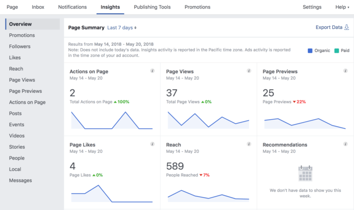
Facebook’s analytics in the Insights tab
From here, you can toggle the date range (currently set to “Last 7 days”), and dive deeper into all sorts of metrics using the grey bar along the side. You can use that sidebar to check on how your posts and reach are faring. Oh, and using the “export data” button in blue on the top right is a good way to get your data out of Facebook and into your computational software of choice (like Excel or Google Sheets). These stats can be accessed on desktop or mobile.
Twitter puts its analytics in a drop-down menu handily accessed by clicking on one’s face.
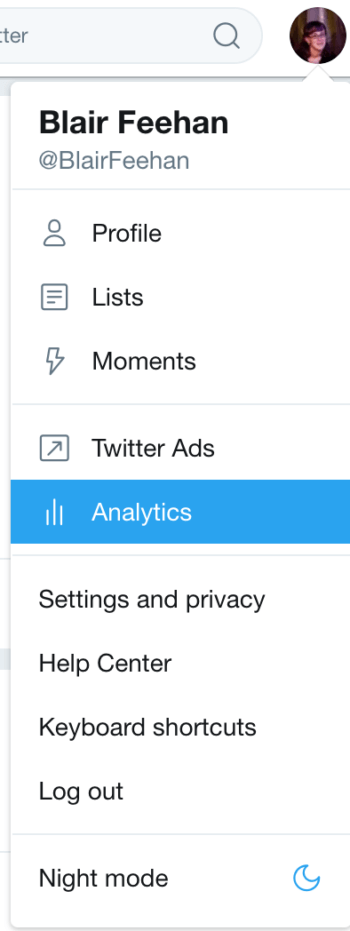
You have to turn on analytics for Twitter, but it’s just one step once you’ve clicked on “analytics” in the drop-down menu.
I should tweet more.
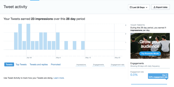
Online, Twitter’s stats are definitely high-level with a strong focus on impressions, though you can scroll down to check on engagements, link clicks, retweets, and more. You can download a .CSV file for more granular insight into your performance. These stats are currently available on desktop only–sorry, mobile users.
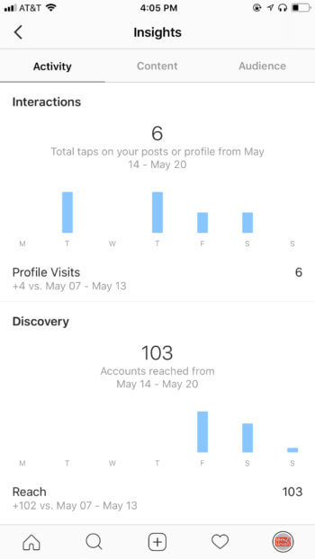
Instagram really wants you to use it on your mobile device, and requires you to be a business (instead of an individual account, though verified accounts are an exception) to see any meaningful stats. Fortunately, once you meet that criteria, you can access a fair amount of information about your activity, content, and audience by navigating to the graph icon in the top right corner of your profile. Thankfully, Instagram’s Graph API allows third-party tools (like ours) to display your stats in the desktop app or web browser of your choice.
Aggregated social media analytics
Okay, we’re biased: we like seeing all our social analytics in one spot. Social media analysis software can make a marketer’s life easier so she doesn’t have to go channel by channel to access her stats. Here’s what we want in a social media analytics app:
- The ability to analyze your stats across multiple channels
- Meaningful insights to help you go beyond the numbers
- Even more stat breakdowns than you can get on native analytics (like follower adds and removes in Instagram, for example)
- Scheduled reports so your favorite social stats are delivered in-app or to your inbox when you need them
- To really take this article to a meta level, custom dashboards are a handy feature too
How do I build my own social media analytics dashboard?
Your (virtual) pencils are sharpened. You’ve found all the data you need in each channel by taking the steps above. You’re fully caffeinated. Now what? Time to turn disparate social media analytics into a colorful and easy-to-read dashboard using Google Sheets and Google Data Studio.
Step 1: Aggregate your data in Google Sheets
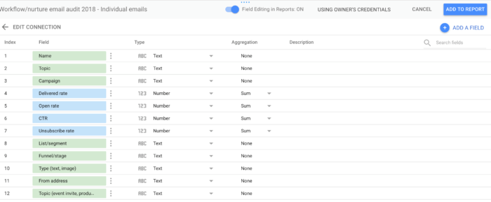
Take those semi-scary spreadsheets you downloaded from your channels of choice, and put each of them in separate, named tabs in a Google Sheet. No need to clean up columns you aren’t planning to use. The bottom of your spreadsheet should look something like this:
![]()
![]()
Wondering about that cross-channel tab? We pulled that right out of Rival IQ, where we’ve got channel-specific reports along with a handy roll-up of how you’re doing across all your active channels.
Step 2: Connect Google Sheets to Google Data Studio
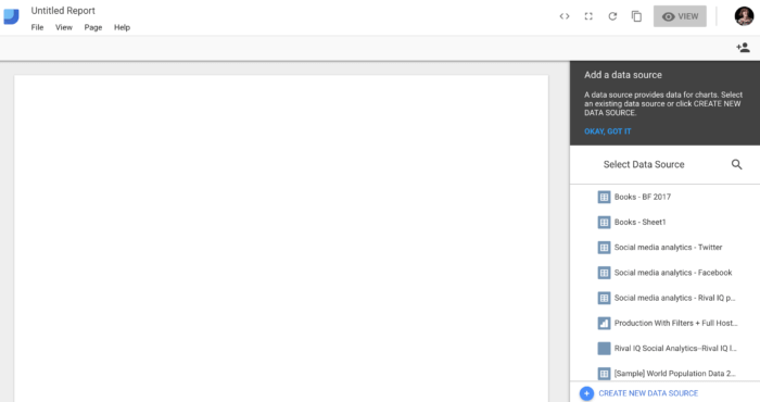
When you log into Google Data Studio and create a new report, you’ll see something that looks like this:
Follow the prompts to select a data source or create your own. If you opt to select your own, you’ll be taken to a page full of GDS connectors, which are external applications that play nicely with GDS (including ours!). Select Google Sheets, and then find the stat-heavy spreadsheet you created in step 1 on this page:
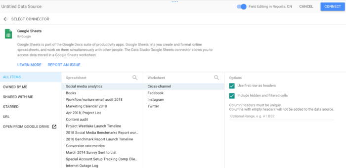
Select the spreadsheet and/or worksheets you want, and then hit the blue “connect” button. Google will prompt you to remove any rows you don’t want, or change their output types (from numbers to text, for example) on a page that looks like this:
Google indicates that you’re all connected by changing the formerly-blank report into a graph paper wonderland, which means you’re ready to get going.
Step 3: Create the custom dashboard of your dreams
We included some sample data on the two pages of our embedded report for reference, but our basic rule of thumb is: as long as your social channel will report on it, you can visualize it. Use the buttons along the top of GDS to create different graphs and visualizations.

Time series, bar chart, combo chart, pie chart, table, geo map, scorecard, scatter chart, bullet chart, area chart, pivot table.
Let’s break down what we featured on our dashboard.
We used scorecards to report on our cross-channel metrics, because they’re great at displaying discrete pieces of data and their red (bad)/green (good) changes over time.
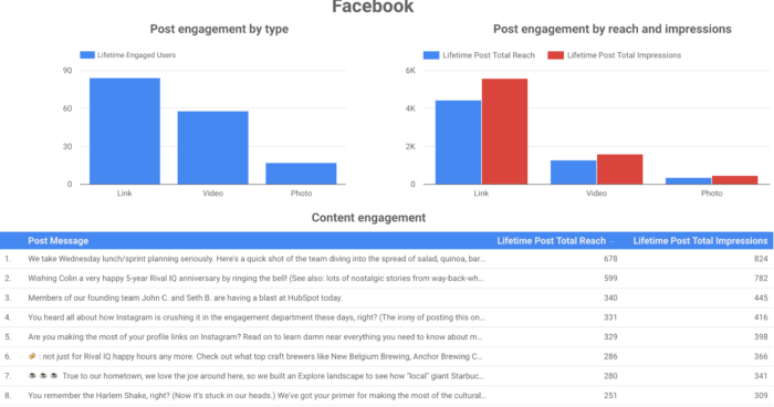
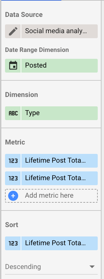
We love looking at post engagement by type, so we created the top left blue visualization using the bar graph.
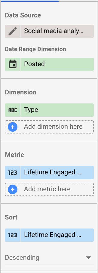
To start, we pointed the data source at the Facebook tab in our spreadsheet. Then, we set our dimension (think “attribute,” like post type) as “type” (for post type) and our metric (think “thing you can count”) as “Lifetime engaged users.” To keep things tidy, we sorted by engagement for descending bars.
This report makes it easy to see that links are our best tool for maximizing engagement on Facebook, and that we should absolutely stick with that post type.
To look a little more closely at the type of engagement we were seeing on each post type, we created the colorful bar graph on the right to look at reach versus impressions using the following setup:
By keeping the data source and dimension the same, we were able to really dig into the types of engagement we were seeing on each post. More evidence that our audience thinks we should stick with links.
You can thumb through the rest of the template for other data visualizations, but here are a few other ideas:
- Content engagement: Display your post/tweet content right next to its engagement for clues about the best words, hashtags, and post lengths
- Engagement by date: Is there a day of the week or month that consistently does well? Map your data using a bar graph or a time series to spot trends
- Scorecard: Represent key data by channel, like URL clicks and retweets using GDS’ at-a-glance scorecards
Step 4: Take things from good to great with titles and date ranges
Two quick steps will help your boss figure out exactly what she’s looking at without you having to walk her through it step-by-step.
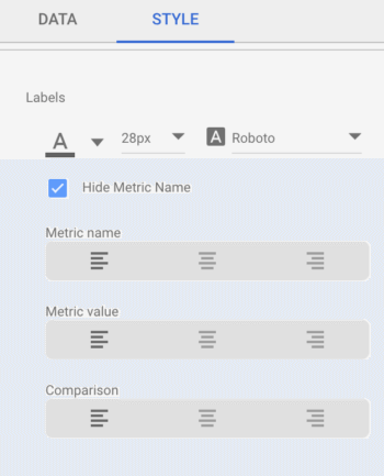
Title, image, rectangle, circle, date range, filter control, data control.
Since creating a dashboard means combining your best data into one or two pages, titles are your friend. Use them to differentiate your visualizations.
Date ranges pull double-duty by both answering the inevitable “What time period am I looking at?” question and helping you recycle the same dashboard all year long. With an easy-to-toggle date range stretched across the top, you can select different time periods from Google’s drop-down menu, or just pick your own dates to feature.
Want more information on using Google Data Studio? Check out this recording and tons of free resources from a webinar we did with data legend Dana DiTomaso.
The most important metrics to focus on
It can be overwhelming to start reporting on your social from scratch, so we want to help you focus on the metrics that matter and leave behind the ones that don’t. Here are a few of our favorites:
- Clicks
- Conversions
- Engagement
- Reach
We recommend these metrics because they indicate how a customer or fan is interacting with us, our content, and our product and can be tracked over time, instead of more one-off actions such as likes or follows.
Paid social
If you’re putting money behind your posts, it’s important to look at a few different metrics to see how your investment is faring:
- CPM: Roughly translated to Cost Per Thousand Impression (but literally stands for Cost Per Mille), this is a great way to see how much you’re spending to get eyes on your posts.
- Cost Per Result: This stat is a little more variable depending on the action you’re trying to get your customers and fans to take.
- ROAS: Sadly, this does not mean Rodents of Unusual Size: it actually stands for Return on Ad Spend. It’s calculated by dividing the revenue your ad spend brought in by its cost (revenue/cost). Many marketers prefer this calculation to ROI because it’s so ad-centric.
Whatever metrics you choose to focus on, be sure they help you answer the question: What’s having the biggest effect on my business/brand/nonprofit/agency?
How often should I report?
The answer to this question of course depends on the nature of your job: if you’re a one-person shop, your reporting schedule will no doubt be different than if you sit on a 25-person marketing team as their analytics guru. Our high-level recommendation is: report as often as you have the chance to share your findings and inform future strategy decisions.
Does your team report quarterly to the company about marketing activity? We bet you’ve got your quarterly reports locked down. Does your boss ask for high-level stats weekly? Your weekly reporting game must be great by now.
If you’re still working on establishing a reporting rhythm, here’s our breakdown:
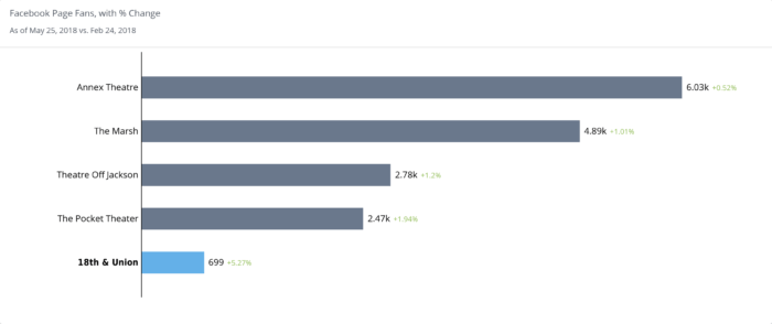
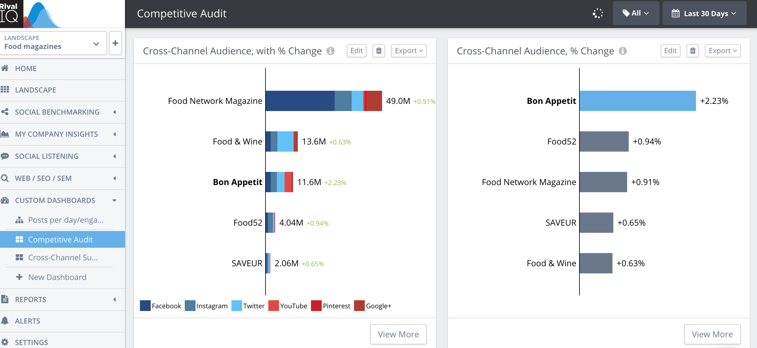
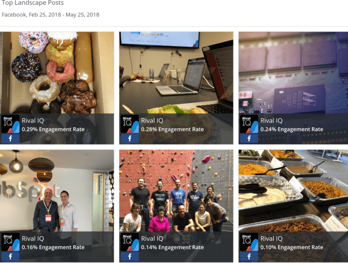
Local arts institution 18th & Union lags behind its competitors in terms of numbers of followers, but it’s blowing them all out of the water when you look at followers added on a percentage basis in the last 90 days.
Yearly and quarterly: big picture
These reports are all about the big picture: what’s happening on your channels over time, and how are your strategies doing against your yearly or quarterly goals? (You did set goals, right?) Did the big change to your social, like investing heavily in Instagram, correspond to a spike in engagement? Are you seeing a bunch of growth or engagement on one channel in particular? If yes, you might want to pivot some of your social energy there in the quarter or year ahead.
Has your social strategy been responsive to new features (like Instagram Stories, for example)? Does your engagement change each year with the seasons or current events (like school getting out or the holidays, for example)? Are there channels you aren’t very active on where you should focus some energy in the quarter ahead? What are your competitors up to, and how can you emulate their success? This level of reporting is all about the 30,000-foot view, and much like a long flight, it’s good to put some time and brain power into these periodic reports.
Monthly: diving deeper
Monthly reports bridge the gap between the granularity of weekly reports and the strategic review of quarterly or yearly reports. It’s great to keep an eye on the content, channels, and post types that are doing well. You’ll also be able to compare completed campaigns against each other, and against the goals you set for them. Monthly reports can also be good for a quick check-in on your social media health: did you lose a bunch of followers this month? Might be good to dig in deeper if the answer is “yes.”
Weekly and bi-weekly: going granular
Weekly reports are great for tracking short time periods and content bursts. Check out how this week’s posts fared against last week’s, or look at the performance of your newest campaign. This is all about the 30-inch view, and unless your whole job is social analytics, we bet you’re not spending more than 30 minutes collecting this information.
Remember: don’t just sit on these analytics! Use them to show your boss and team that your strategy is working, and to refine your strategy and content so it resonates strongly with your audience.
Competitive benchmarking: How do I know how I’m doing?
Building up a treasure trove of historical social media analytics is great, but without information about what your competitors are up to, you’ll never be able to accurately answer the question, “How do I know how I’m doing?”
Enter benchmarking. Taking a look at how your competition’s social media analytics measure up to your own provides the context you need to see what works well in your airspace. Anyone can have a million Facebook fans or Twitter followers, but you’re only reaching those fans successfully if you’re doing it better than your competitors.
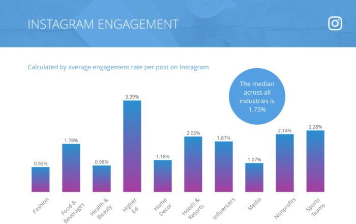
Seeing how Instagram engagement shakes out across all industries helps put your own success in perspective.
The basic premise with benchmarking is identifying key competitors and leaders in your industry, and then keeping an eye on their social metrics over time to check against your own stats. If you’re Pepsi, you’re probably crawling Coke’s social presences on the regular to see how their page likes and key engagement metrics (remember: likes, shares, comments, etc.) compare to your own performance. The very same goes for smaller or more local competitors.
It’s pretty safe to say we’re obsessed with benchmarking over here, so much so that we make a big, free report every year tracking Facebook, Instagram, and Twitter performance across top industries like fashion, food and beverage, media, sports teams, and more. To see how your industry is doing at a glance, read and download the report here.
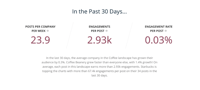
And to keep things current and interactive, we also have live-updating benchmarks for top industries, like top-performing hashtags and posts, posting frequency, and more. Use these for a current snapshot of how you measure up to your competitors.

Use case: How do we report on social media analytics at Rival IQ?
Curious how we walk the talk? This group of self-professed data nerds loves reporting on our social media progress. Here are a few ways the company keeps an eye on social success:
Give the people what they want: more posts about what we’re eating!
Monthly full-team metrics meetings
Our marketing team reports on our social footprint in the prior month to the whole team. We take a close look at our engagement rate by channel month over month, and also strive to identify any content, content types, or paid campaigns that we should emulate next time around. (For a full write-up on metrics at Rival IQ and how it relates to pizza, read on here.) For example, we’ve recently noticed that many of our top posts on Facebook feature what we’re eating at work, so we’re working on including more of that content into our editorial calendar.
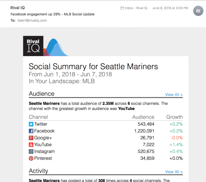
Emailed reports
Let the robots do some of the work for you by having them crawl your social progress and your competition instead of having to do it manually. Emailed reports from within our app are customizable, so if we want to track a particular campaign or arch nemesis, we can choose how often to get the info in our inboxes.
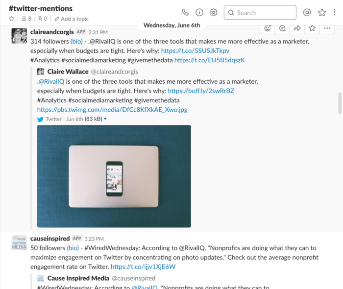
Social mentions Slack channel
Our resident computer science Ph.D. used automation tool Zapier to cook up a quick Slack channel of all our Twitter mentions, so we can check out who’s chatting about us without leaving the comforts of Slack. Knowing who’s talking about us in real time helps us know who we should be talking to and which content is garnering the most retweets or shares. Want to do this too? Check out the Twitter mentions+Slack integration on Zapier.
Quick reference guide: social media analytics glossary of terms
Things might get a bit technical, so we’re stashing definitions of some commonly-used social media analysis terms here so we’re all on the same page.
Engagement: Measurable interaction on social media posts, including likes, comments, favorites, retweets, shares, and reactions
Engagement rate: Engagement interactions divided by total follower count
Channel: The app you’re using to share your content or connect with your audience (Example: Facebook, Twitter, Instagram, Pinterest, Google+, etc.)
Followers: Anyone who’s chosen to like, follow, or otherwise actively opted into your content and activity on a social channel
Audience: Anyone you’re hoping to connect with on social (note: this goes beyond followers, since it’s possible to reach people who don’t actively follow you thanks to the amplifying power of your followers liking and sharing your content with their networks, or ads, or fancy algorithms no one can decode)
Post type: The media, often limited by the channel, you can share to engage your followers (Example: videos, photos, and carousels but not links on Instagram; photos, videos, status updates, links, and just about anything on Facebook)
Reach: The total number of people who see your content
Impressions: The number of times your content is displayed
Reporting on this report: how’d we do?
We hope this guide has gotten you excited about reporting on your social media analytics. We’re firm believers in the idea that you can’t argue with cold, hard data, especially when it’s beautifully presented in a way that anyone can understand.
Inspired to create your own dashboard in Google Data Studio? Have another way of making your metrics presentable to the masses? We’d love to hear from you on Facebook or Twitter, so don’t hesitate to drop us a line!
This post was originally posted on June 12, 2018 and has since been updated.