We’re rolling out oodles of new features in Rival IQ to help you spot patterns in your social media reporting to the nth degree!
From Time Lord levels of control over time series charts to more automated insights and beyond, we have even more ways for you to get your metrics Your Way.

Endless analysis possibilities with the new posting activity/engagement rate visualization
The sky’s the limit with our brand-new panel in Social Posts that maps the fluctuations over time in your posting activity and engagement rate. This new panel is just a version of our tried-and-true Activity & Engagement panel, which is designed to help you stack rank your competitive landscape by posting frequency or engagement rate, mapped over the time period of your choosing.
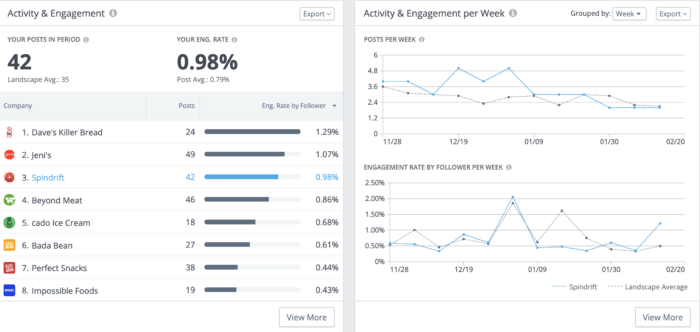
In this example, Spindrift has the third-highest engagement rate in its competitive landscape in the panel on the left. But things started to get really interesting when we look at the new Activity & Engagement per Week panel on the right. The blue line represents Spindrift’s activity and engagement while the grey dotted line aggregates averages for the entire landscape over the selected time period.
Studying the relationship between the two lines shows that Spindrift was posting almost twice as frequently as the rest of the brands in the landscape around the end of December with a nice bump in engagement rates in their third week of increased posting. What caused the spike? Maybe it was a targeted campaign, or had to do with the holidays, or a product release. If only there was some way to easily hone in on the content that made up these spikes…
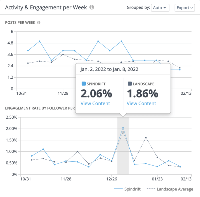
But wait, there is! Hover over any time period for a “View Content” pop-up that’ll easily show you what your brand or landscape was up to in a time period where you’re looking for more insights.
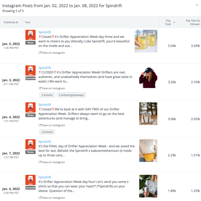
It’s easy to see that Spindrift’s Drifter Appreciation Week campaign was a hit through these way-above-average engagement rates, since Spindrift normally sees engagement rates around 0.98% on Instagram in this time period. It also makes sense that Spindrift’s competitors weren’t seeing comparable engagement lifts, since it would be tough for them to post successfully about Drifter Appreciation Week. We hope this visualization will help Spindrift’s social team see that the Drifter Appreciation Week campaign was a hit and should be considered again next year.
We encourage all brands to monitor their posting frequency and engagement rates regularly, but this new visualization goes from good to great when you realize just how much it can do.
Ever wondered how time periods with more of one particular post type or content strategy is performing over time? Pop into the “View More” mode and select a Post Tag you want to learn more about.
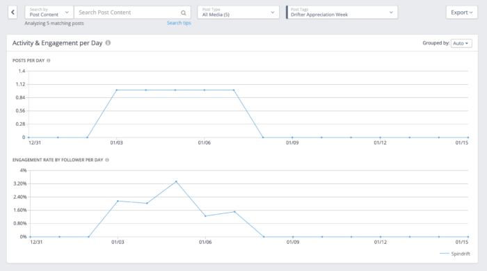
As we saw above in the Activity & Engagement panel, Spindrift was rocking a 0.98% engagement rate during this time period, so it’s noteworthy that all their Drifter Appreciation Week posts tagged here performed well above that.
This view is great for social media managers keeping careful tabs on targeted campaigns like Drifter Appreciation Week, or monitoring other posting trends over time to see what’s happening with engagement.
Easily compare your top- and worst-performing posts to spot patterns in your social
There’s a new Social Posts layout in town designed to help you identify commonalities in your best posts so you can redouble your efforts with that strategy and worst posts to make sure you prune social strategies that aren’t working as well for you: enter Top vs. Bottom view.
We’ll display your top 9 and bottom 9 posts sorted by the engagement of your choosing (engagement rate by follower, video views, comments, etc.) as a visual way to gut-check your social strategy.
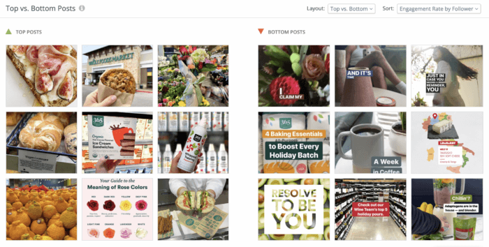
Let’s look at the above example from Whole Foods Market. It doesn’t take a Ph.D. in social media to spot that nearly all of WFM’s top-performing posts by engagement rate on the left feature close-ups of food, while almost none of the posts with the lowest engagement follow suit. Another key difference between the best and worst posts? Text overlays. Obscuring a glamour shot of a tasty morsel with text doesn’t seem to be doing WFM any favors when it comes to engagement.
The Top vs. Bottom layout is simple but powerful, and can be further customized depending on the data geek at the keyboard. Try “Top vs. Bottom with Details” for info about the post type, channel, and key metric right on the post, and don’t forget to play around with your selected metric to see if patterns change when measuring by, say, engagement total vs. shares.
This new layout is available in Social Posts, Post Tags, and Company Profiles for all users.
Group your metrics by time interval for a complete picture of what’s working and what’s not
Every data nerd wants to know the “why” behind their metrics. We want to make it easier than ever to arrive at that answer, which is why we’re rolling out new ways to group your metrics by time interval in Rival IQ.
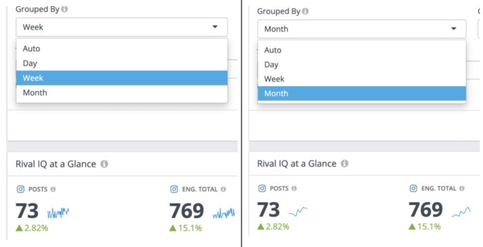
Group by day, week, or month in time series charts
Lovers of time series charts, this next one’s for you: you can now group by day, week, or month in every time series chart in Rival IQ to go granular or zoom way out on your analysis. We hope this level of control smooths out any noise and helps you identify trends effortlessly.
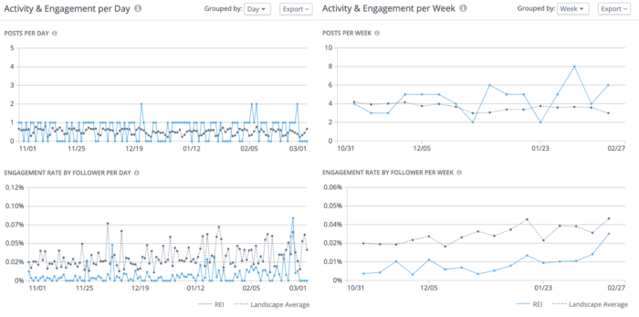
This side-by-side look at the same data is a good example of how handy it can be to group your data by a specific time period. We’re looking at posts frequency (top) and engagement rate by follower (bottom) in both graphs for REI vs. the landscape average. The left graphs are grouped by day, which shows many data points in a crowded graph. The graphs on the right are grouped by week and make it easier to spot that REI’s engagement rate is actually trending up when looking at the blue line in the bottom right quadrant of the graphic.
Toggling between grouping by day, week, and month is truly the power move: grouping by a larger time period helps you see trends like the one above, while grouping by day is great for diving into the content that led to specific engagement spikes or trends upward.
Affect your sparklines by changing time intervals
Sparklines can be a great way to identify trends, but they can get a little hard to parse when they try to cover too much ground. To help, you can now group your sparklines in Custom Dashboards and your At-A-Glance panels by day, week, or month so these handy lines bring to mind a relaxing yoga class instead of what your heart rate looks like when Instagram goes down.
Let’s look at post frequency and engagement total with two different time overlays in Custom Dashboards, focusing on the blue sparkline. On the left, the blue sparklines are grouped by week and show a lot of variation, though you can start to see a trend emerging. Toggling your time interval to sort by month on the right shows an upward trend happening for both post frequency and engagement total, which means this is probably the version you want to put in the presentation to your boss.
You can put these handy At-A-Glance panels into any Custom Dashboard in Rival IQ for easy access to top-level metrics and trends. We’ll also automatically update your sparklines across Rival IQ when you set a time series panel to group by day, week, or month.
Automated time intervals take the guesswork out
We’ve automatically selected the right interval based on your time period throughout the app so you can focus on the data and takeaways that matter most. You’ll always have control over the time interval in your charts in Rival IQ, but we hope that automated intervals give you a head start.
For example, if you’re looking at your Twitter activity and engagement for the last seven days, we’ll be sure to set your time series graphs to sort by day, since grouping by month won’t help you much there. The opposite goes for looking back at 12 or 24 months of data–we’ll sort that by month for you so you don’t wind up with the world’s most jagged chart before you’ve even had your coffee.
More automated insights with Popular Topics Observations
Popular Topics are a handy way to understand themes and issues your competitors are commonly discussing on social and how posts that mention these topics are performing. We’ve made those competitive insights easier than ever to access by including automated observations.
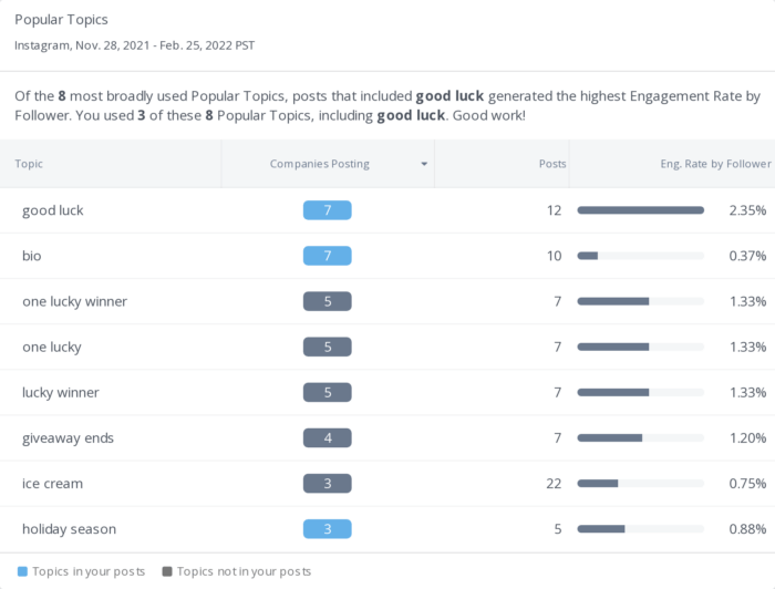
In the example above, this brand included “good luck” in some of its most successful posts (as indicated by the blue rectangle in the “Companies Posting” column, but didn’t include other related Popular Topics like “one lucky winner.” Since it’s a good bet that the content of posts that mentioned these topics had to do with giveaways, this brand can see at a quick glance that changing up their contest post language could result in additional engagement.
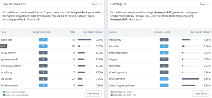
Longtime fans of Rival IQ will recognize this insight format from our beloved Hashtags panel, which is also handy for generating ideas about trending hashtags among your competitors. In both cases, our Natural Language Processing (NLP) is working hard to flag content and ideas that are working well or performing poorly so you can easily integrate those learnings into your content strategy.
Don’t forget that these panels are easily sortable, especially if you click to “View More,” where you can set a minimum number of companies posting about this Popular Topic for custom filtered results.
Analyze and aggregate all your company’s handles in one place
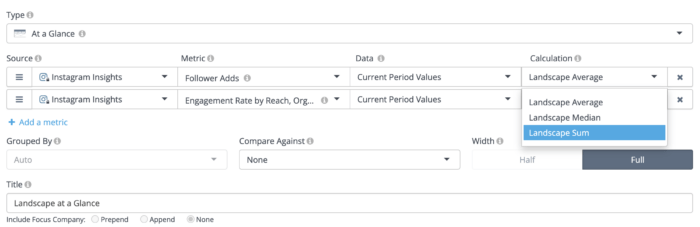
Do you manage multiple social media accounts and struggle to keep track of all your private data? Stores with multiple locations or brands offering localized social media depending on geography, we’re looking at you. Reviewing data for multiple private handles involves the headache of switching between browsers and accounts in native analytics, which is why we’re adding the ability to compute flexible aggregations, like sums and medians, when you’re analyzing private data for multiple handles.
Compare and contrast owned handle performance in Custom Dashboards
In the fictional example below, Acme Co. has multiple Instagram accounts from around the world that they can now compare in one handy panel within Rival IQ. Easily build panels like this one with private metrics like follower adds, engagement rate, post reach, and beyond for all of your owned handles.
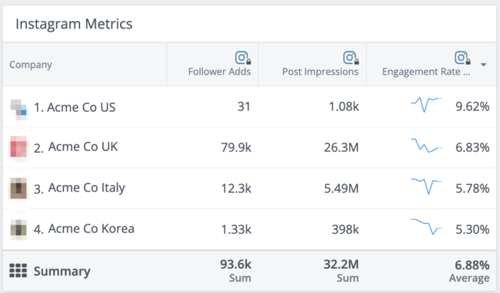
It’s easy to see in this panel that Acme Co. Italy grew its follower count by about 12K compared to poor Acme Co. US who added just 31 followers in the time period. This disparity might be worrisome for Acme Co.’s parent company until they pop over to the engagement rate column, where Acme Co. US is pulling down engagement rates nearly twice as large as Acme Co. Italy, proving that follower counts aren’t the only metrics that matter.
Savvy marketers might be drooling over the new Summary row, which makes reporting on the activity of all your owned channels easier than ever.
Let’s look again at the Acme Co. example from above. As you can see in the summary row at the bottom, Acme Co. has added over 93,000 followers, earned more than 32 million post impressions, and is rocking a 6.88% average engagement rate across all of its handles in the selected time period. Zooming out to look at the big picture can help brands celebrate major victories like these without getting bogged down in the details while also making you and your boss look really good at executive-level meetings.
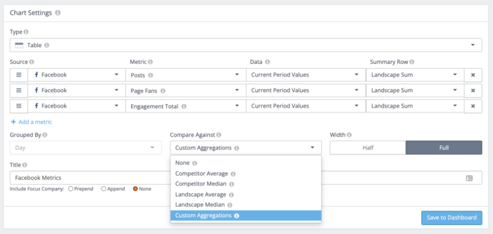
The best part of this new summary row? It’s not contained to just private data–you can add sums, averages, and medians to any landscape-level Custom Dashboard in your account. Just select “Custom Aggregations” in the “Compare Against” dropdown when editing your Custom Dashboard chart and we’ll take care of the rest. Hooray for math you don’t have to do yourself!
This new view for comparing owned handle metrics is available within Custom Dashboards, where we’ve rolled out many other new ways to slice and dice metrics from your owned handles. These new data aggregation features are available for all Engage Pro and enterprise accounts.
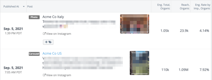
New Social Posts widget for private data
Looking for post-level comparisons for your owned handles? Pictured below is the new Social Posts widget in Custom Dashboards, where you can easily review posts from social handles you own for a complete picture of how your brands are doing side-by-side. You can pop this new widget into any existing or new Custom Dashboard to keep tabs on your performance metrics.
Not sure where to start when comparing owned handles? We’ve got a bunch of new private data templates in Custom Dashboards to help you get the information you need like an At A Glance widget with key stats, a panel with customizable columns for your most important metrics, and top-performing posts.
Other awesome new private data goodies
Private data benchmarks
It’s no secret that we love benchmarks around here, which is why we’re excited to roll out the ability to benchmark your performance against your landscape. This feature is handy for making sure you’re outperforming your brand rivals rather than benchmarking against, say, your whole industry as seen in our Social Media Industry Benchmark Report.
“Of course I can benchmark in Rival IQ,” you might be thinking. But the secret sauce here is that you can benchmark against *private* metrics like reach for a full picture of how your brands are doing on social and if there are any handles in particular that are standing out against engagement rates or posting frequencies that make the most sense for your brand.
Private data exports
If you’re excited about these new ways to slice and dice private data but wishing for ultimate control, we’ve got you covered with new CSV exports.
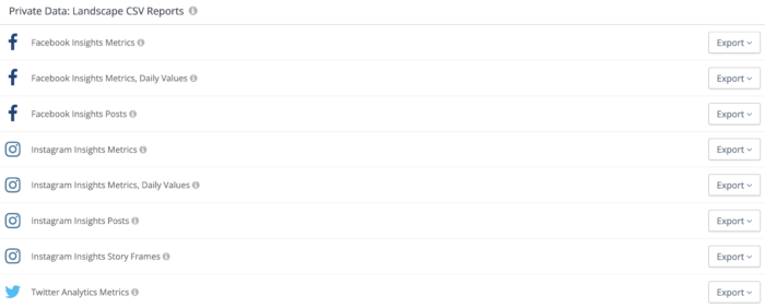
We’ve curated a bunch of new CSVs you can download full of Instagram Story data or LinkedIn Analytics metrics focused on your Updates. Spreadsheet lovers will now be able to concatenate and vlookup to their heart’s content with all their private data.
Wrapping it up
We had a blast creating all these new features to make it easier than ever to spot patterns in your social media data, and hope you have just as much fun playing around. Everything outlined above is now live in Rival IQ, though we’ve noted a few places where you’ll need an Engage Pro or enterprise account to access them. If you’re interested in expanding your capabilities in Rival IQ, use the big blue button on the bottom right of your screen when logged into your Rival IQ account, or just drop us a note on Twitter.
Looking for even more insights on these exciting new features? Join us for a training webinar led by our Product Manager Denna Bettini for the inside scoop.