
Source: Shutterstock
Tomorrow, Google rolls out its latest update, broadening the use of mobile friendliness as a ranking signal. The goal here is for users to get more mobile-friendly websites and relevant app content in their search results. This Google mobile-friendly update has been deemed “Mobilegeddon” – for fear the penalty could nose dive mobile site rankings – and traffic. When it goes into effect on Tuesday, April 21, Google says it will have a significant impact.
This, of course, isn’t a newsflash. It’s something we’ve known about for months.
Google’s taking cues from information we’ve had: 90 percent of U.S. adults own a mobile phone. And Google’s actions have historically been consistent with its mission for quality and relevancy
In past updates, Google “taught” us to place value on high-quality, relevant content, as spammy sites slid to Google Siberia. Now, Google’s focusing on usability and user experience, and making sure this update prompts businesses to do the same.
Before you panic, here’s what you need to know, plus a few “triage” steps you can take in these last waning hours or in the coming days.
Google Mobile-Friendly Update at-a-Glance
Source: shutterstock
- Google has stated the update will have a “significant impact” on search. Google Webmaster Trend Analyst Zineb Ait Bahajji was quoted at SMX Munich as saying the update will have more of an impact on Google’s search results than Google’s Panda or Google Penguin updates. Though, the details and the scale won’t be known until it goes into effect.
- The April 21 update impacts mobile search results, and it’s understood desktop rankings won’t be affected. However, it makes sense to take this as a signal to get going on an update before Google factors it into these results.
- It also seems Google tablet search results will index under desktop search results:
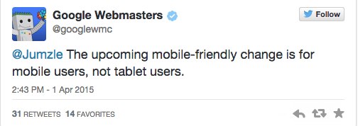
Photo credit: Seroundtable.com
- When it comes to mobile apps, it may be likely having a high-quality, well-reviewed, keyword optimized app has a beneficial impact on your mobile search results. It may also be likely businesses with desktop sites that have apps but whose sites aren’t mobile-friendly will not fare as well. However, alongside Google’s mission for quality search, consider it’s advantageous and economical to Google that Google Play apps do rank higher.
- The jury is still out whether the update will have a greater impact on Android search or affect both Android and iOS equally. According to com, 80 percent of the smart phone market is comprised of Android users, though they make up a significantly lower number in search and revenue results. And, there’s speculation Google will launch a new mobile crawler, increasing its efficiency to crawl single-page and Android apps.
You Want Your Site Labeled Google Mobile-Friendly
Last November, in an effort to provide mobile users a better experience in search, Google announced it would be labeling sites “mobile-friendly” in search results.
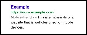
Source: Google
In order to qualify, Google labeled sites “mobile friendly” that met the following guidelines:
- Mobile-friendly software––no abnormal software, like Flash.
- Legibility and Display. Content is easy to read and doesn’t require horizontal or vertical scrolling to do so.
- Ease of link selection. Mobile sites that have links far enough apart to easily tap.
It’s well known that Google and most developers recommend responsive design over other architecture. Though, there’s some indications as long as the above three qualifications are met, Google may give a pass on architecture where SERP is concerned.
Take the Google mobile-friendly test for your own Website!
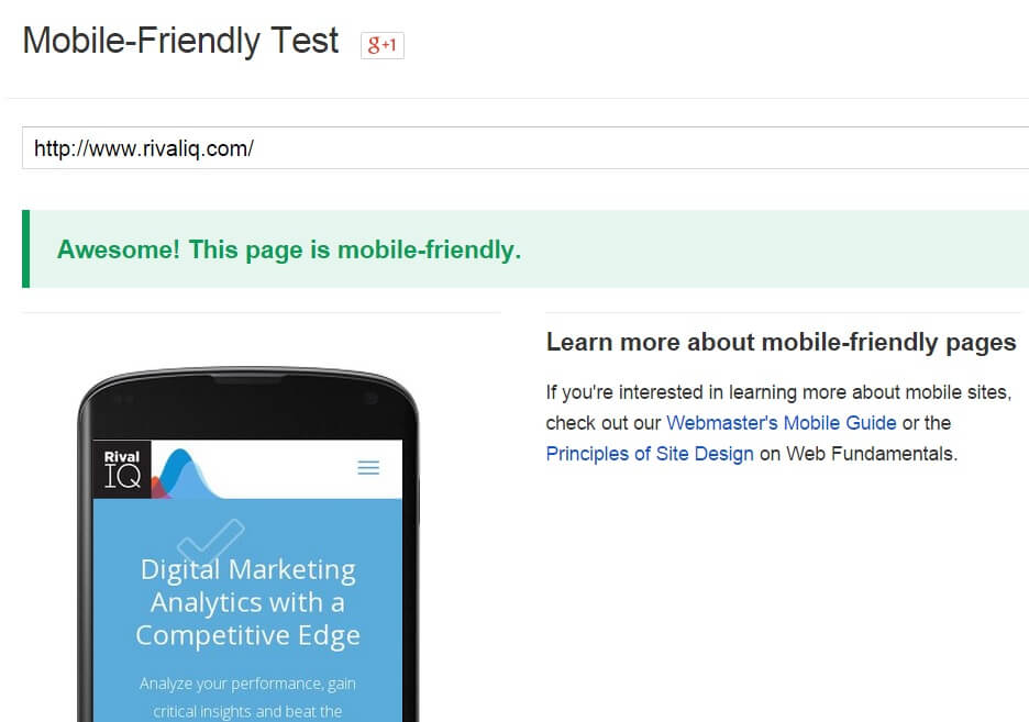
We ran a test of new.rivaliq.com, and it was rated “mobile friendly”!
Google (and everyone else) has recommended you take the mobile-friendly test to see how your site will do. While this is the most direct step you can take prior to the update, beware that this is more forecast than certainty.
A look in Google forums reveals quirks. For example, one user queried why test results showed his site was mobile-friendly when his site didn’t match any of Google’s mobile-friendly criteria. Another commenter noted he had completed the updates required, but the test still showed the site was not mobile-friendly.
Triage Steps You Can Take

Source: Shutterstock
If you don’t see that “mobile friendly” label and/or fail the mobile-friendly test, there are a few triage steps you can take to help lessen the blow. Google provides a list of mistakes you can rectify – that’s a good starting place this late in the game.
Here are some other tips and resources:
- Your CMS might help! Google provides a linked list for common software many businesses use to build their sites. According to one study, 93 percent of small businesses in the last three years were not mobile ready. The good news is many small businesses opt for content management systems like WordPress, Drupal and Joomla, all listed here. Check out the list and instructions for each; it can be as simple as a plug-in to make a site more mobile-friendly and at least passable.
- Fix Top Traffic Pages First: Whether you have a responsive or dedicated site, note your high-traffic pages, then use Google’s “Fetch as Google” tool to see how Google renders your site and reads Java, CSS and images files, a factor that’s important in creating a mobile-friendly site. It’s a way to target and focus on fixing key pages on your site prior to the update, making it easier for Google to index them.
- Use Redirects if Needed: If you have a dedicated mobile site, you can take the same approach for top traffic or conversion pages on your site, by making sure they re-direct to the mobile page equivalent. You can do this quick-fix approach for each error. This isn’t optimal, as you want to fix all “faulty redirects,” but it will help your site display in mobile results, while you continue to make updates.
Stay Calm and SEO On

Source: memegenerator.net
While this latest Google mobile-friendly update is just around the corner, making a strategic start by focusing on key pages on your site might be your best bet. Thereafter, make it a priority to optimize your site and make it truly mobile-friendly. If your team does not know how to do this, then find an agency or consultant to help you. There are so many experts out there that do this for a living!
On the eve of “Mobilegeddon,” keep calm and SEO on!