Rival IQ does a great job of collecting data and presenting it in easy-to-use graphs and charts. The most common chart we see marketers export shows change during a date range — week over week, month over month, year over year, etc. Here’s how to do this in Rival IQ and Excel.
Create a Custom Chart in Rival IQ
If the metric you want isn’t already curated in a detailed metrics section in Rival IQ, create your own in the Custom Dashboards page. Just select a date range you want to use, a data source (you might pick Twitter, Facebook, or a different source), a data point (followers, engagement rate, or one of the many other metrics in Rival IQ), and a graph type.
For this walkthrough, I’m using a market landscape of Internet delivery companies. I created a chart that shows the growth of Twitter followers week over week using My Charts.
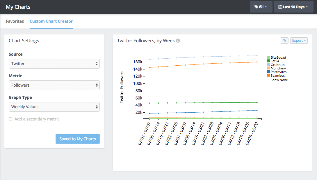
Pick the channel, metric, and data series
Depending upon the metric and date range you are looking at, select a Graph Type to get the relevant time series by day, week, or month. Match that time series to the date range that you need. Once you have done so, go ahead and save!
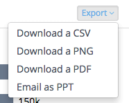
Export Your Week Over Week Change Data
Then, I exported the data to CSV – comma-separated-value format – which I know I can open in Microsoft Excel. Use the Export feature in Rival IQ to export the data to CSV and now you’re ready to go to work.
Finally, I used the data I exported from Rival IQ into CSV and an opened it in Excel to make a pivot table. Now, I can answer the question: How do you create Week over Week charts in Rival IQ and Excel showing a change in % for every week with just a few steps?

5 Steps to Create a Week Over Week Change Pivot Table in Excel
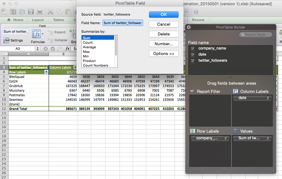
1. Open your CSV in Excel and Create a Pivot Table
Open your CSV in Excel and highlight all of the rows available to you.
Select Data > Pivot Table and confirm the selection by clicking “Ok” – this will place your data in a new pivot table in a new worksheet.
2. Select The Fields Important to You
Using the Pivot Table Builder, drag —
- company_name field to the Row Labels area
- date field to the Column Labels area
- twitter_followers field to the Values area
3. Change Followers Value from Count to Sum
In the Values area, click the twitter_followers field and change the Summarize by: option from “Count” to “Sum.” This will give you the sum of Twitter followers for that company on that date.
4. Add Another Field to Calculate Week Over Week Change
Next, drag another twitter_followers field to the Values area.
- Follow Step 3 to change Summarize by: from “Count” to “Sum”
- Click “Options >>” and select the option to Show data as “Difference % from”
- Set Base field to “date”
- Set Base item to “(previous)”
- You are now set! Click “Ok”
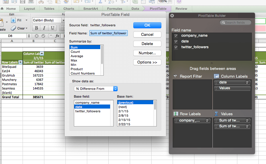
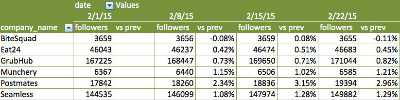
Your pivot table now has a new column displaying the difference in % for the sum of Twitter Followers from the previous date range (in this case, a week).
5. Finalize and Share
Format this PivotTable by turning off the Totals for row and column. You’ve now got a handy table depicting week over week change that you can include in your deck alongside the graph you got from Rival IQ. You might even want to use conditional formatting to color cells having a significant up or down change in the week.
If you’d like to learn more about using the data in your Rival IQ account to answer questions about your digital marketing analytics, let us know – we’d be happy to talk!