Most marketers will agree that competitor research is key when establishing a marketing strategy. The question is, how many marketers continue to monitor their competitors after the initial research is done? You don’t want your business to start losing customers because your competitor has upped their game. In this post, we’re going to show what you can learn from analyzing your competitor’s website redesign.
Overall Look & Feel
If your business doesn’t have the time or the budget to invest in a web design that might not do the job, you can relax. Chances are, your larger competitors do have the ability to invest in the research it takes to find the perfect design for maximum conversions. All you have to do is monitor their moves and the best design is likely to be revealed.
Let’s take Sprout Social, the robust social CRM tool for business. Rival IQ picked up changes to their web design in early 2013.
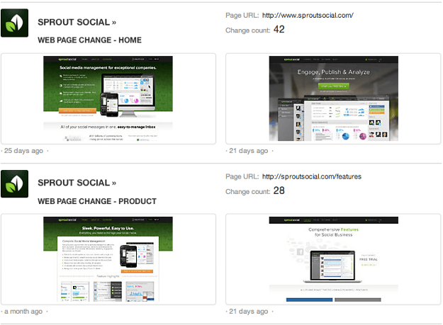
These changes were not minor – and any social media tool for business would be wise to note the key updates they have made. Just by browsing the thumbnails, you can see that the new look and feel is much cleaner with less text and larger images. Now, let’s dig deeper.
New Products, Services, and Features
The first thing you may want to find out when a competitor updates their website is whether they are offering new products or services, or if they have made significant changes to their existing products and services.
One of the things you will notice immediately about the opening of the features page is the difference in text. Before, there was a lot to read. The main tagline on the product focused on design and user experience.
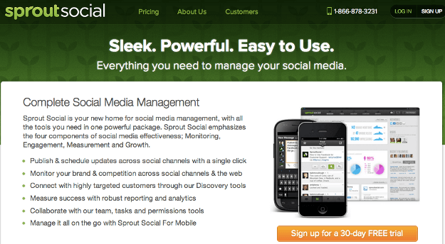
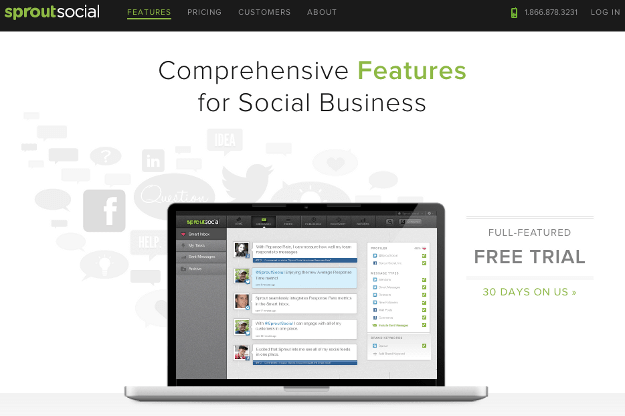
In the new design, most of the opening text has gone away, and the main tagline focus on the power of their product.
Before, there was again a heavy emphasis on text on the page, particularly bullet point lists. The top three features they focused on were the dashboard, monitoring, and analytics.
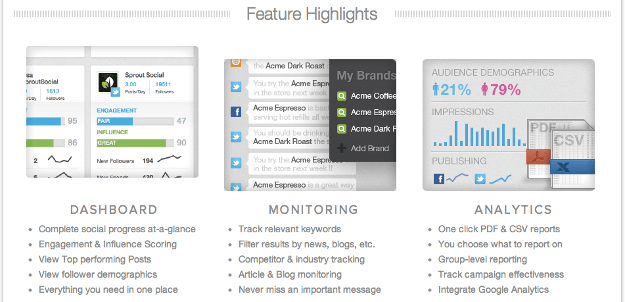
After, the text has gone away and the top features highlighted are the ones that most people will be interested in: engagement, publishing, monitoring, and analytics. They also specify that all plans include the main features listed.
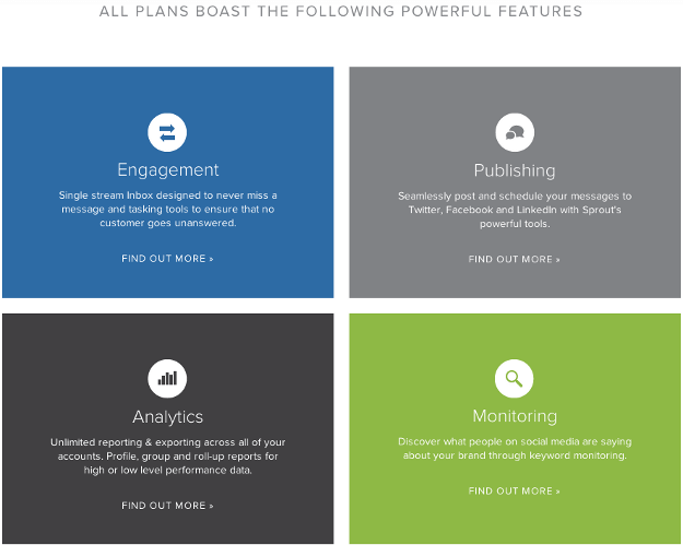
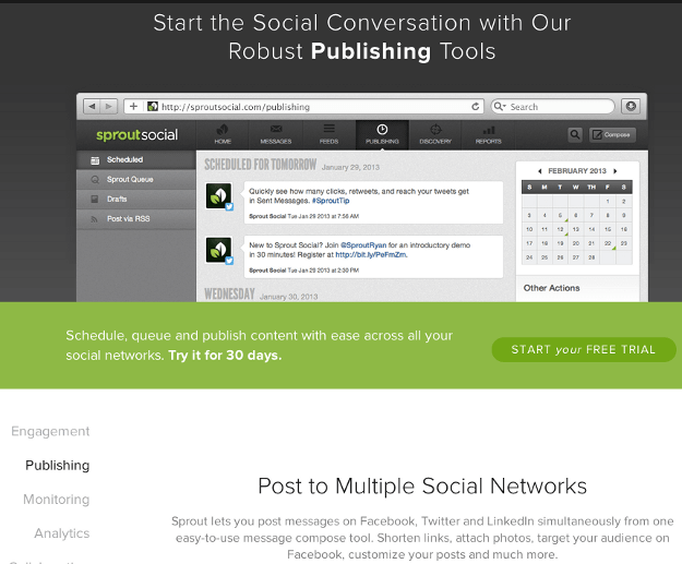
You can click through to each to learn more, just as you could on the previous design. Even the individual features pages now have a more streamlined look with less text and a larger image emphasis at the top.
Pricing
Since the pricing page is where your main conversions happen, it’s especially important to anazlye the changes to it. In Sprout Social’s case, the before look included a darker theme and the pricing order was from highest to lowest.

In the new look, the pricing goes from lowest to highest and the text about the features in each level changed slightly. They also changed the wording of downgrade to change.
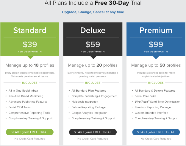
Beneath the pricing table, they previously listed the social networks they work with. In the new look, they instead note the fact that all plans include free personal accounts for paid team members and mobile apps.

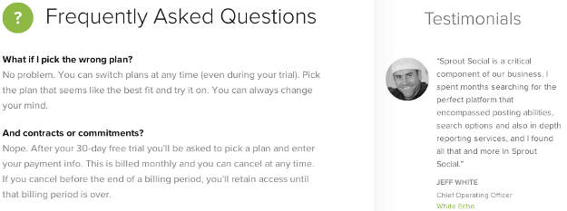
They also modified the look of their FAQ below the pricing options. Before, the section felt a little more cluttered with the questions on the left, logos of brands they worked with on the right.
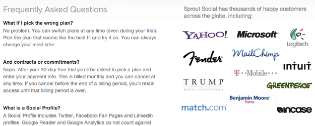
After, the look is cleaner and the testimonials are in place of the logos.
Conversion Testing & Strategy
Chances are, Sprout Social did some heavy A/B testing to determine the best ways to design their call to action buttons to increase free trial signups. Overall, the reduced amount of text on the main pages make it easier to recognize the call to action buttons without the need to make them boldly colored, something you may have noticed on the homepage and throughout the site. Here is the homepage before.
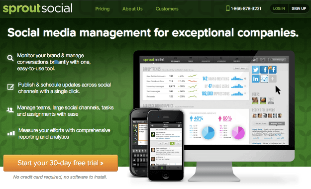
And here it is after with a more mute, yet still obvious call to action.
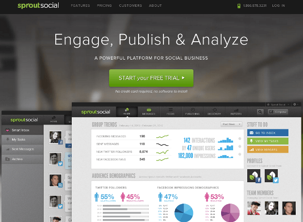
Another area you may note changes to are the navigation bar. Before, there was a steady log in and sign up button at the top right. After, the navigation bar changes from just showing to the log in button to showing a bold free trial button as you scroll down the page.

It’s a perfect change as people are more likely to want to sign up for a free trial as they scroll down the pages on the site to learn more. Having the button appear while the page is moving makes it more eye-catching.
Trust Factors
Trust factors are the elements that help a potential customer feel more confident in their decision to buy from your business. Before on the Sprout Social site, they were only found on the homepage.

It was missing on other key pages such as the pricing page and the product features page. In the new look, however, they implemented them into the footer to be displayed on all pages throughout the site.
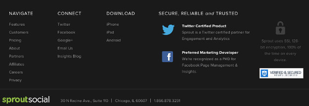
They also lessened the chance that people would click on the links to the Twitter and Facebook development centers in this change. While the links are still there in the new footer design, they are less obvious to click on than the badges in the previous design. This will prevent people from leaving the Sprout Social site and potentially discovering one of their competitor’s in the developers directories, especially on Twitter’s page where you are greeted with Adobe Social, HootSuite, and other products before you get to Sprout Social’s listing.
They also added more video testimonials from the brands they work with on their customer’s page. Before, you could only see the main video, followed by a call to action. After brand logos, you would then find additional testimonial videos.

After, you can see three videos, directly followed by logos of brands using their product.

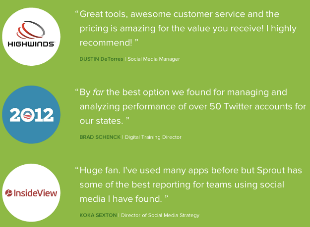
The testimonials also stand out more in the new look.
Copy
The above points are just the things you can notice at a glance while going through a competitor’s website redesign. When you’re going through website changes manually, it can be difficult to note the more minute copy changes that have happened beyond headers and call to action buttons. This is where Rival IQ can make your life simpler by highlighting these changes.
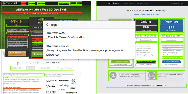
With our tool, you can find out if your competitors are just making over their layout or if their copy has been modified as well. You can also find out if your competitors have made any changes under the hood. For example, Sprout Social did not change any of their search optimization tags like the page titles or meta descriptions. Another popular internet marketing tool, Raven Tools, did.
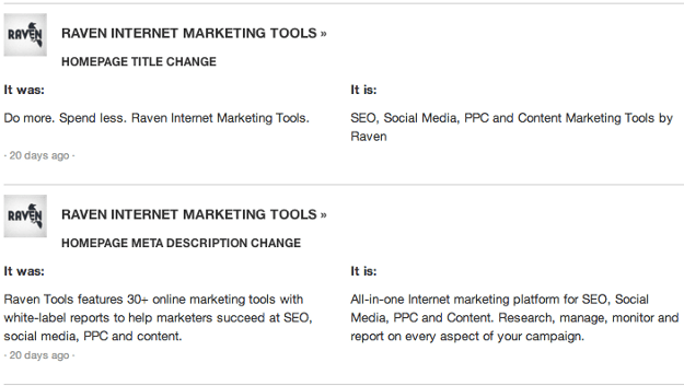
Considering the importance of the copy used on a homepage’s key on-site search optimization tags in relation to how a website appears in search, being able to see these changes when they happen can be vital in on-going competitor research.
Key Takeaways
So what have you learned from taking a walk through of this social media tool’s website change?
- Less text can make your calls to action stand out.
- Allow people to quickly see your product top features without having to read too many details.
- Trust factors should be on every page you have a call to action.
- Small changes in copy can make a large difference.
- Remove options for people to leave your site as much as possible to increase conversions.
What did you learn about the redesign, and how can you see Rival IQ’s tool helping you monitor competitor’s website design changes? Please share in the comments! Also, be sure to sign up for Rival IQ to research your competitors – the first 14 days are free !
